6 ecommerce website UX design best practices to supercharge your sales
Published October 2021
Published Oct 2021
6 min read

AI Summary
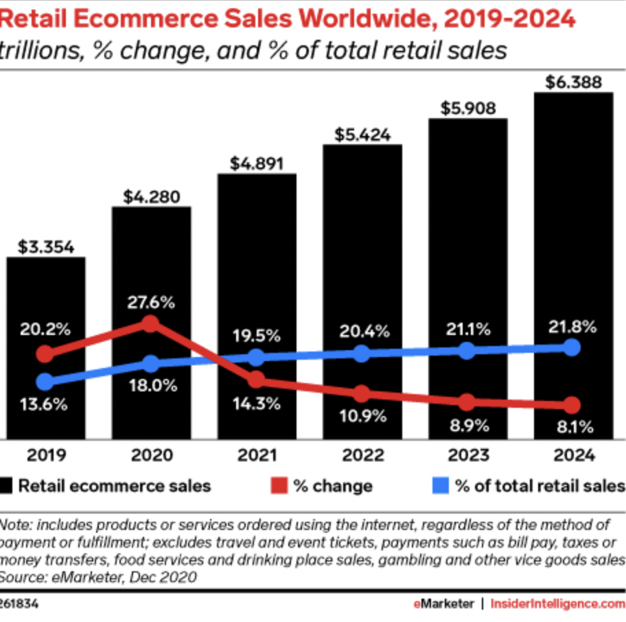
It’s no secret that since the COVID-19 pandemic, the ecommerce industry boomed. In fact, the ecommerce market is expected to reach $4.89 trillion by the end of 2021.
It’s no secret that since the COVID-19 pandemic, the ecommerce industry boomed. In fact, the ecommerce market is expected to reach $4.89 trillion by the end of 2021. As more and more merchants make the most of the opportunity, it has become increasingly harder to stand out from the competition. Your ecommerce website is the front door to your business, so how can you create a memorable user experience?
To capture customers’ attention and keep them coming back for more, merchants need to ensure they’re meeting their customers’ demands and offering them an exceptional customer experience online. A lot of this comes down to the design of your ecommerce website. Getting it right will give you the best chance of success.
In this article, UK-based Shopify Plus partner agency, Velstar, deep dives into six tried and tested UX design practices you can use to turn your ecommerce store into a conversion generating machine.
Dig deep into your data
All too often, ecommerce owners get hung up on their own design preferences or what their competitors are doing, without considering what their customers actually want. In ecommerce, the customer is always king. You need to understand what makes your customers tick – their likes, dislikes, wants, and needs. You need to make it as easy as possible for customers to find your store and buy your products.
So before you begin designing your ecommerce website, make sure you dig deep into your customer data. If you’re redesigning your existing site, the process is a little easier. This is because you already have heaps of rich customer data at your fingertips. For example, you can use data from Google Analytics to help create buying personas, track traffic sources, customer behaviour, popular products and customer pain points.
At Velstar, our team of conversion optimisation specialists also use heat mapping and conduct a secret shopping audit to gain a thorough understanding of customers’ interactions with our clients’ stores. We then use this information to develop bespoke digital experiences that their customers will enjoy, as well as guarantee conversions.
So, what happens when you’re designing a new store?
If that’s the case, a good starting point would be to do some competitor research. Go through your competitors’ stores and test the customer journey all the way from the homepage to the shopping cart. This will give you a starting point. You’ll see the challenges customers face and you can resolve them on your store.
A mobile-first approach
Mobile traffic is on the rise, so much so that the search engine giant, Google priorities mobile-friendly websites over desktop. So, if you’re not designing with mobile in mind, you’ll be leaving a lot of money on the table, particularly if you’re targeting Millennial and Gen Z audiences.
Remember, mobile commerce is about more than just ecommerce on a mobile phone. From mobile payments and location-based services to AR and AI, every customer touchpoint needs to be accessible and optimised on mobile.
A few things you can do to ensure a smooth mobile experience include:
- An easy to access /add to cart function
- Big, easy-click buttons
- One-page checkouts
- Digital wallets e.g. Apple Pay, Paypal, One Touch
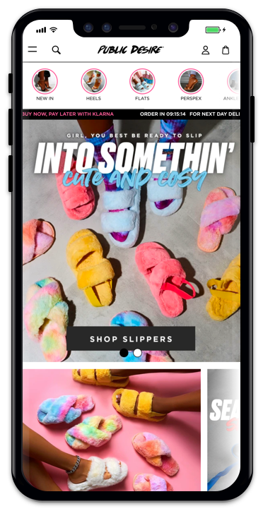
Seamless on-site navigation
One of the biggest conversion killers is poor site navigation. Customers have short attention spans. They’re not going to waste their time endlessly scrolling, searching for the products they want. In fact, 50% of lost sales are because visitors can’t find what they’re looking for. It’s imperative that you make navigation as seamless and intuitive as possible on your ecommerce website.
Ensure that your search bar is visible throughout the shopping journey – on every page. And keep your navigation menu to the top left side of your site pages, because this is where your customers expect to find them. And, don’t forget to use high-quality product imagery across your store, because even the very best designs look bad with poor quality imagery.
When it comes to site navigation, you should always be thinking of ways is to reduce any barriers to purchase.
Always keep site speed top of mind
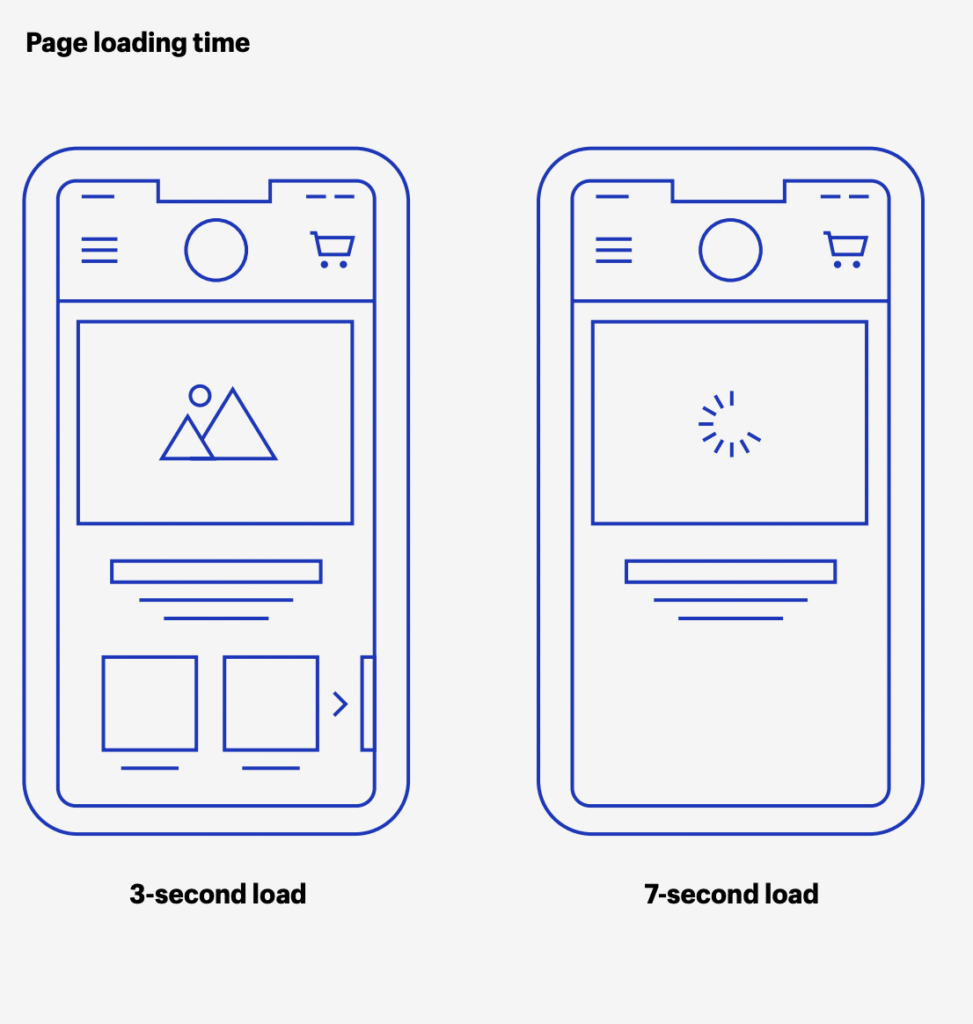
Never underestimate the importance of site speed. Research by Google shows that 53% of mobile users will abandon a site if it takes longer than 3 seconds to load. And a one-second delay in load time can affect conversions by as much as 20%.
Every design decision you make for your site should be centred around quick loading speeds. During the design process ask yourself whether you really need lots of video content, a beautiful 4MB PNG image, or whether the font you want to use will be on your customer’s computer, these might make your site look flashy, but they can have a significant impact on the speed of your site.
Simplicity
Well designed sites are often the simplest. You really don’t need to reinvent the wheel. If something works for your business and your customers, don’t change it, or overcomplicate it. Simplicity is key.
Test, test and test again
Like with everything in ecommerce, testing is an essential part of the design process.
You can design the most innovative store and follow every single best practice, but at the end of the day, your customers will have their own set of unique needs. The only way to know what works is to continue to test your site and assess the changes you make.
The customer journey is never constant. What drives significant results today won’t necessarily work tomorrow. Customer expectations are always changing. In order to continue to optimise your store for conversions and stay one step ahead of the curve, you will need to keep adapting.
Whether you’re just starting out or are years into your business journey, if you need assistance designing a user experience that will compel your customers to buy and keep them coming back for more, get in touch with our team of UX designer, today.

Categories
