
Custom analytics reports: the 4 subscription reports worth building first
Published July 2026
Published Jul 2026
Updated August 2026
Updated Aug 2026
5 min read
AI Summary
Four custom Recharge reports worth saving: which products drive subscriptions, where churn concentrates, top recurring revenue, and how promo cohorts retain
You already know the questions that decide your month.
Which products are pulling in subscribers, where churn is quietly leaking, which cohorts actually stick around past the discount.
The hard part isn’t coming up with questions: it’s dealing with the monotony of answering them. Rebuilding the same filtered view every Monday. Dumping everything into a spreadsheet to get the one cut of data you need. That’s the tax you pay before you get to do any actual thinking.
Custom analytics reports fix that.
You start from a standard Recharge report, filter and group it the way that makes sense for your team (by product, segment, cohort, or billing cadence), and save it as a view you open any time instead of rebuilding from scratch.
Without further ado, here are the four reports we think you should build first (named after the questions they’ll help you answer):
| Report | The question it answers | Start from | Group / filter by |
|---|---|---|---|
| New subscriptions by product | Which products convert subscribers? | Subscription checkout order items | Product, month over month |
| Churn by collection | Where is churn concentrated? | Churned subscribers | Product collection, monthly |
| Recurring revenue by product | What keeps getting reordered? | Subscription recurring orders | Collection filter, product grouping |
| Promo-cohort retention | Do deal-driven subscribers stick? | Churned subscribers | Acquisition cohort, monthly |
Custom Analytics Report #1: Which products are actually driving new subscriptions?
Some products quietly do the heavy lifting on acquisition, converting shoppers to subscribers at checkout while the rest coast. Could you name yours right now? Most merchants can’t, not without digging.
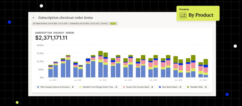
Group your checkout order items by product and compare month over month, and the answer stops being a guess: you see which products generate new subscriptions, and you see the moment one stalls.
So when a product that crushed it in March goes soft in April, you catch it in April.
That usually means a price change, a tired product page, or a competitor making a move, and you still have runway to respond. Test a sharper first-order offer, rework the page, or flag it to the team while it’s a wobble and not a trend.
How to set it up
- Open the Subscription checkout order items report.
- Add a Product grouping.
- Enable the comparison date range.
- Save the report.
Custom Analytics Report #2: Is subscriber churn hiding behind one product category?
Your blended churn rate is an average, and averages lie.
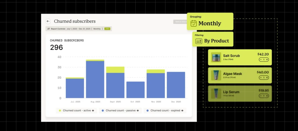
A 6% number can be 3% across most of your catalog and 15% in one collection that’s skewing the whole dataset. Filter the churned subscribers report to a single collection and you find out which it is. That’s a far more useful diagnosis than “churn is up,” because it points at a specific fix instead of a vague worry.
When churn clusters in one line, go look at that line: the product experience, whether the default frequency matches how people actually use it, how hard the cancel flow fights for the save. The right offer at the right moment is usually all it takes to keep someone.
How to set it up
- Open the Churned subscribers report.
- Add a Product filter and select the products in the collection.
- Set the grouping to monthly.
- Save the report, then repeat for each collection you want to monitor.
Custom Analytics Report #3: Which product in a collection earns the most recurring revenue?
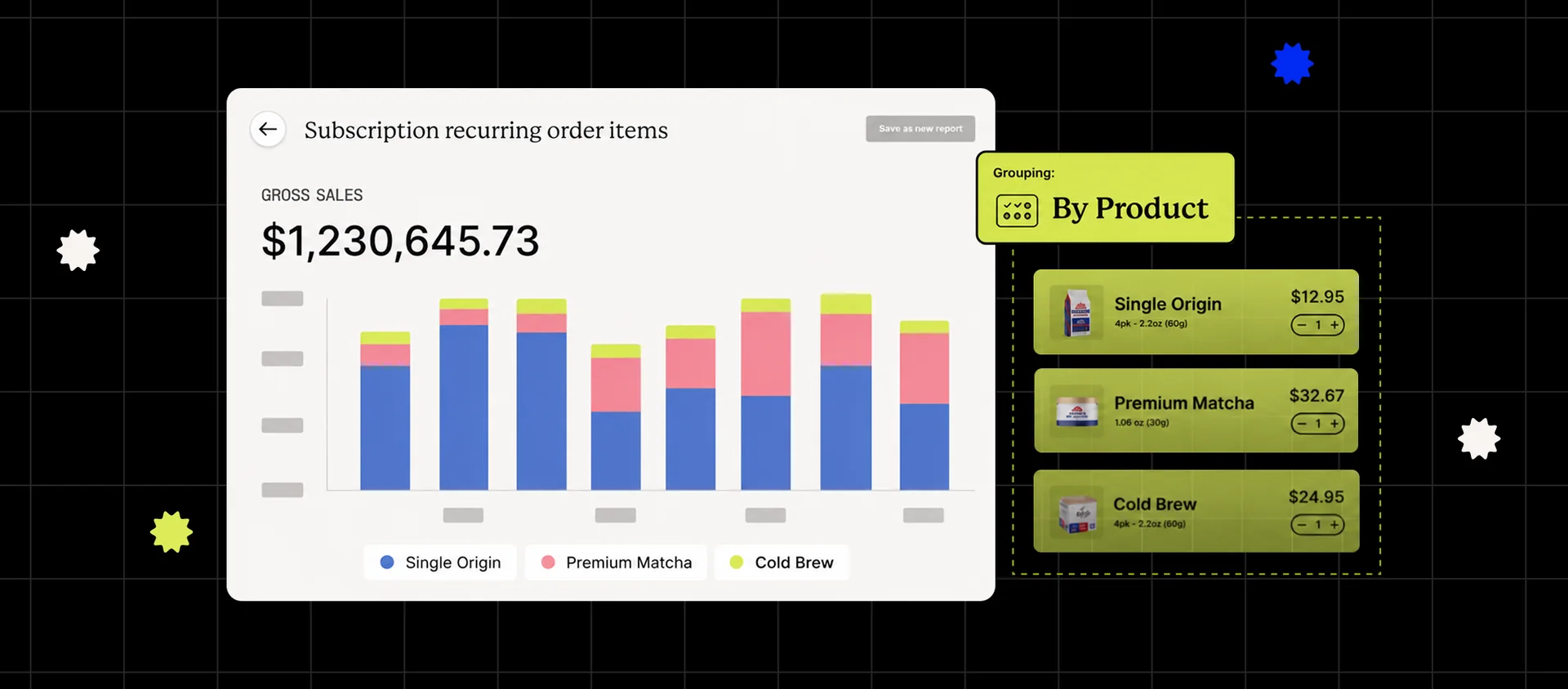
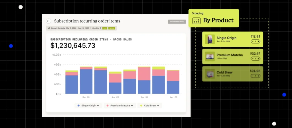
Two products can sell the same on day one and look nothing alike by the third reorder. Filter recurring orders to a collection and group by product, and you get a clean ranking of what subscribers keep coming back for.
That ranking tells you what to anchor your bundles around, what to slot first in upsell flows, and which products look fine at checkout but never become a habit, which is your cue that the subscribe-and-save offer needs work.
How to set it up
- Open the Subscription recurring orders report.
- Add a Product filter and select the products in your target collection.
- Add a Product grouping.
- Save the report.
Custom Analytics Report #4: Do your promo subscribers actually stick?
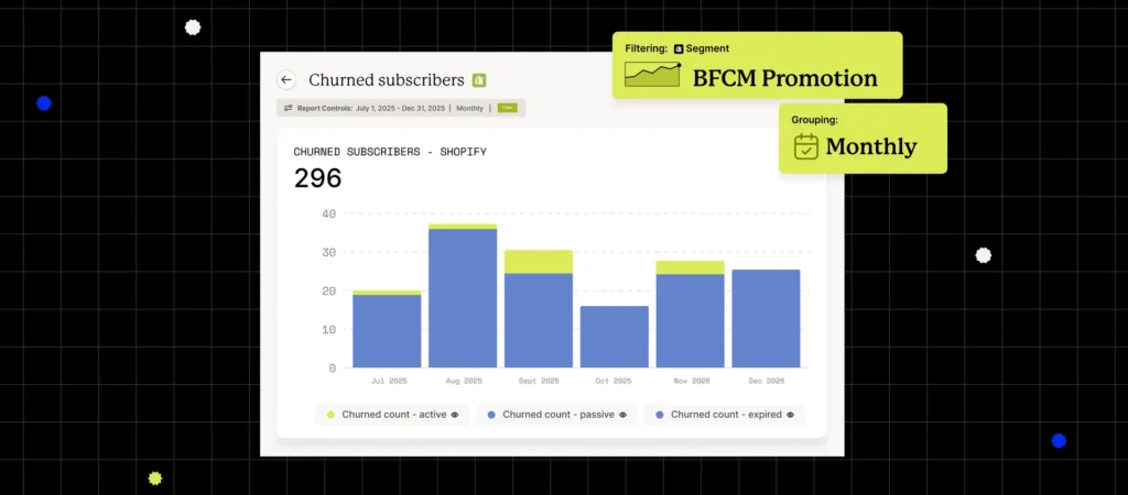
Every BFCM hands you a sugar high of new subscribers. But the question that matters lands in February: how many are still here? Filter the Churned subscribers report to the cohort you acquired during the promotion, group by month, and watch how they track against your baseline.
Promo subscribers often churn faster than organic ones, and it isn’t a mystery: a lot of them signed up for the deal, not the product. If your data says the same, that’s the cue to change the offer, not run it again. Add a longer prepaid commitment, build an onboarding flow that proves the value before the second charge, or design a promo that attracts people who’ll stay. The report turns “promo churn feels high” into a number you can actually manage against.
How to set it up
- Define the promotion cohort by its discount code or sign-up window.
- Open the Churned subscribers report and apply that cohort as a filter.
- Set the grouping to monthly and add your baseline churn as a comparison.
- Save the report.
Build the reports your team actually needs
Every custom report starts from a standard Recharge report. Pick the filters, grouping, and date grain your team reaches for most, save the view, and the weekly rebuild becomes a glance. The brands that catch the slowing product and the leaking cohort early aren’t working harder. They just stopped running reports by hand and started watching the few that earn it.
Frequently asked questions
A saved, reusable view of your subscription data, built from a standard Recharge report and shaped around the products, segments, cohorts, or billing cadences your team watches most, so you build the cut once instead of every week.
Every Recharge merchant. You build them right inside the merchant portal, with no spreadsheet exports.
Custom reports are the views you build and save yourself. AI-Powered Analytics Reports are monthly, AI-generated summaries tailored to your store that flag growth opportunities, churn risks, and what to do next. Most teams use both.
Custom Analytics Reporting is available to all Recharge merchants. Learn more about Recharge Analytics
Categories

Related articles
Explore additional content that complements what you’ve just read.

2026 Black Friday marketing strategy for subscription brands
The quarterly upgrade: subscription retention’s most underused lever

Ask your store anything, get the answer from Remi

Beyond the promo cycle: Dermalogica’s playbook for growing subscribers without discounts

Recharge welcomes Skio to build the future of subscription commerce